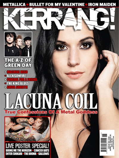
Kerrang
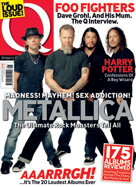
Q Magazine
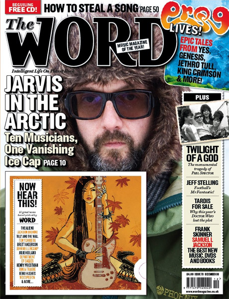
The Word
Mojo
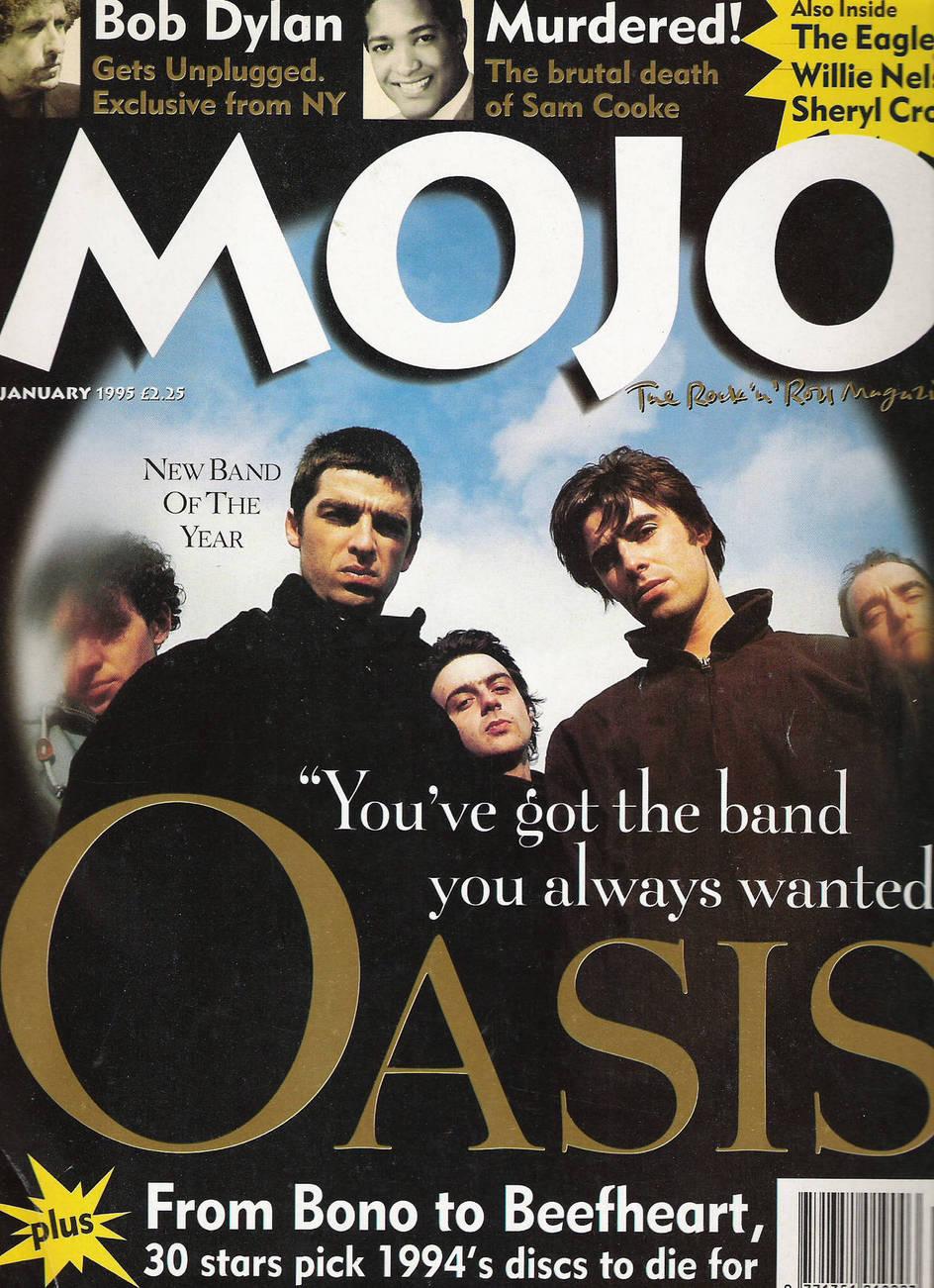
We also completed an analysis of magazine covers, for example:
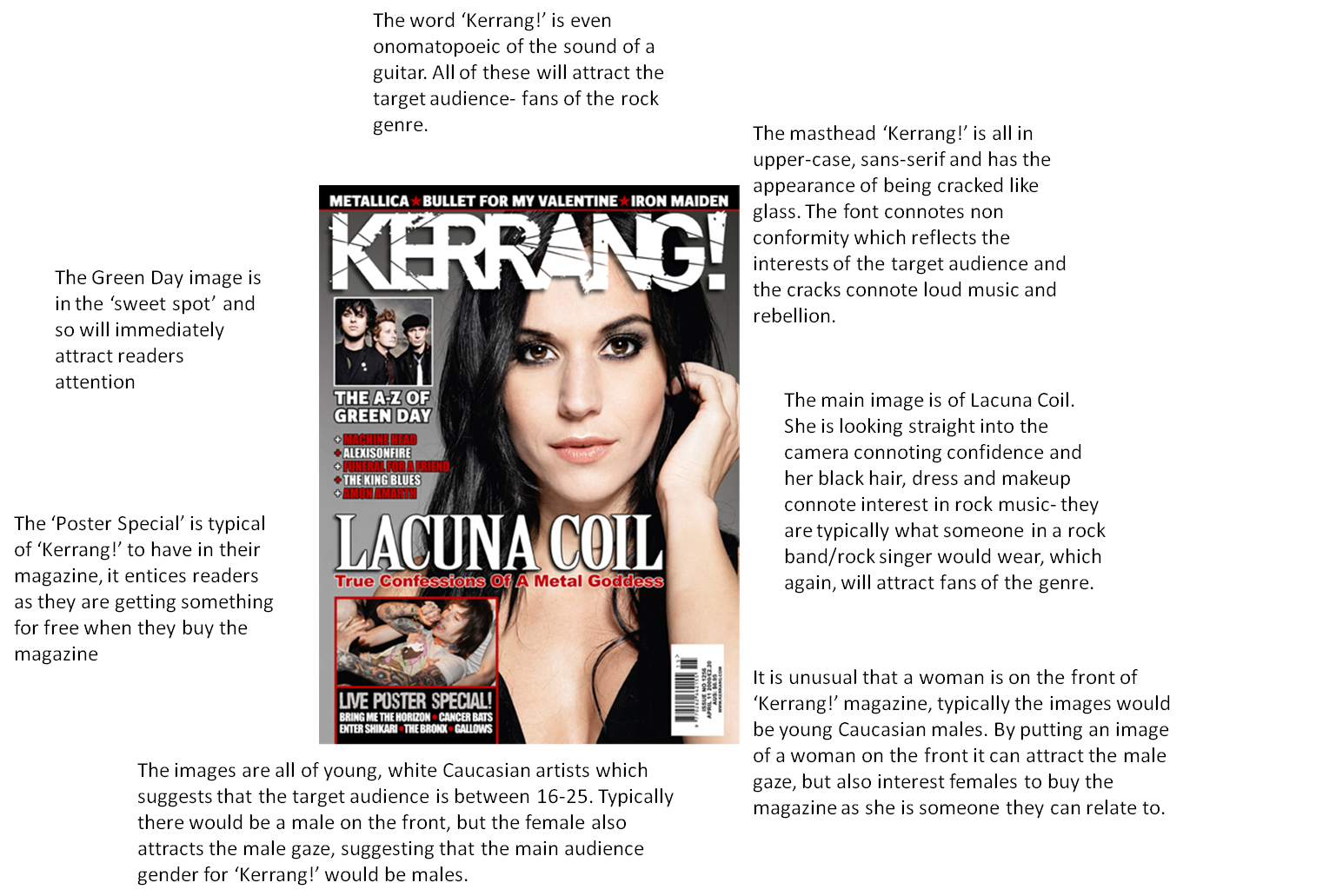
As a class we looked at the websites of the music magazines which allowed us to see what types of articles feature in them to help with our double page sperad too.
I mostly looked at the 'Kerrang!' website as I was planning on having a similar target audience- aimed at youths, and those interested in alternative music.
Through looking at the websites and annalysing the 'Kerrang!' cover, I learned the codes and conventions of music magazines to help with the design of my own product.
In addition to researching the websites and covers of magazines, we researched insitiutions that distribute magazines. For example, Bauer Media Group.
Designing the product

The first thing that I did when planning for my music magazine was to make a mind map for what I wanted to do for the cover. I used this mindmap as a guideline when planning the cover for my magazne and I think that I mostly stuck to the ideas on this page when making my magazine.
I thought of names, ideas for the cover and the audience so I had something to work towards when making the magazine.
For the cover I knew I wanted someone holding a guitar to make it clear that it was a music magazine so from there I wanted a name that linked with guitars and began to come up with names that I could use.
I then had to think of current and relevent story lines for the front cover of my magazine. I wanted my audience to be sixth form girls, so from about 16-18/20 so had to think of musicians that are in the chart now and that already have a lot of public attention so that people would want to buy the magazine.
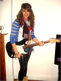
FRONT COVER- The next thing that I did when planning for my music magazine was take pictures for the front cover. I wanted to have someone holding a guitar so I got my friend to pose with one. I took a lot of pictures and then chose about five of my favourites. Some of these pictures included:

- I then picked the one that I thought would work best as the front cover overall and added a masthead 'Chords' because I thought it linked in with the picture of the guitar well.
- I then began to add cover lines that were appropriate to my audience such as cheap concert tickets and artists that are in the charts at the moment such as Taylor Swift and JLS.
- I did a puff in the sweetspot and added a gutter at the bottom of the page. I also included some free posters in the bottom right hand corner using original pictures that I took myself at concerts that I have recently been to. - I also added a strapline 'strum your way to new music' again linking in with the guitar theme of the magazine.
- I used the same font for the whole of the cover and used a white, red, blue and black colour scheme
- To make the main article stand out, I put a red box around it so it was more prominant than the other coverlines
The final cover looked like this:

CONTENTS PAGE
Similarly for the contents page I included original images of artists that I had recently seen in concert including Taylor Swift, Miley Cyrus and Justin Bieber.
- I split the contents page into three coloums 'Features', 'In Every Issue' and 'Events' so it was easy for readers to find what they wanted.
- I also highlighted using a red box around everything that was included on the cover so that readers can easily find the coverlines they are interested in reading inside the magazine
- I included a montage of images at the bottom with page numbers superimposed on them to show which story they corresponded to in the contents.
- I included a montage of images at the bottom with page numbers superimposed on them to show which story they corresponded to in the contents.
- I used the same font and colour scheme from the front cover to the contents page to show continuity of design in my magazine.
The final contents page looked like this:

DOUBLE PAGE SPREAD
After the cover and contents of the magazine were made I began to make my double page spread. The first photos I took for this included these:
After the cover and contents of the magazine were made I began to make my double page spread. The first photos I took for this included these:


However, after putting the double page spread together, my teacher and I found that it looked very similar to the cover and contents and there wasn't much variation with the photos.
Another problem I had with the first double page spread was that although I used the same size font on both pages, one came out larger than the other.
The first double page spread I made looked like this: 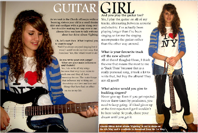
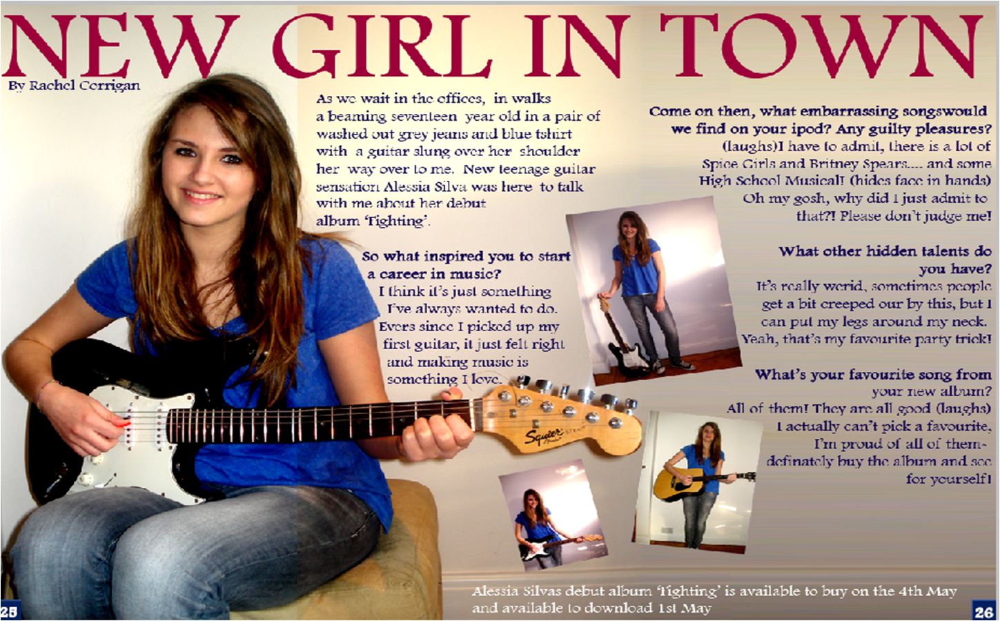
I decided that it would be better if I were to re-do the double page spread. I redesigned the double page spread and set about taking new pictures that would give the image I wanted to create. I think the second version works much better as a double page spread and looks much more professional.
The second double page spread I made looked like this:
This double page spread looks more professional because it has page numbers, the title goes across both of the pages and all the text is the same size
This double page spread looks more professional because it has page numbers, the title goes across both of the pages and all the text is the same size
No comments:
Post a Comment